I love to optimize a funnel as much as the next guy. Working at Airhelp as the CIO, I’ve seen our VP of Product do some amazing things to help conversion, and reduce drop-off post user acquisition, some of it is a little clever but in general we stay away from Dark UI because our customers have told us that trust is one of the things they look for most in our service.
I recently realized that we were still paying for Hulu.com when we never watched it, and I decide to cancel it. While I really respect the gumption required to push the envelope to the far edge of profitability (I can only imagine the results of A/B testing these cancellation funnels: “We reduced the cancellation rate by .5% which translates into 45M ARR!”), I really get a kind of sick taste in my mouth from this cancellation funnel.
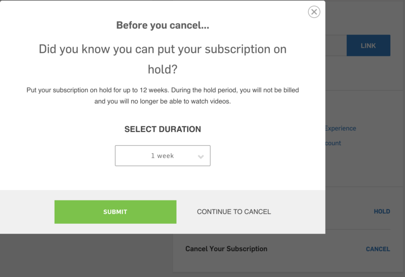
It’s not clear what the benefit of putting your subscription on-hold is for the consumer. For Hulu, it’s clear because you’ll forget you put it on hold, and they’ll at least get one more credit card cycle charge when they take it off hold before you cancel again. But that’s fine. Nice try. Please don’t go.

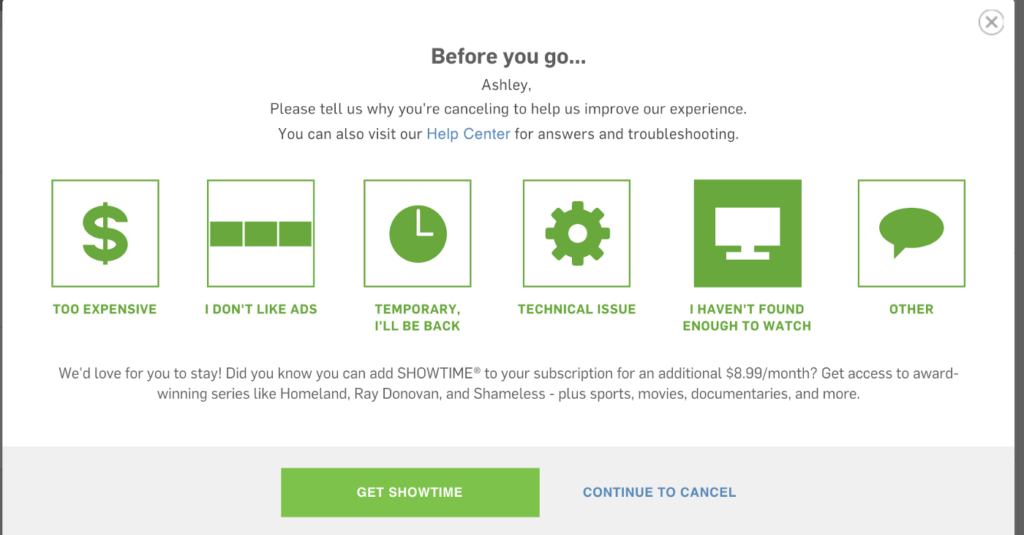
And now I’m offered some choices. That’s okay too, it feels like standard user research. What the hell, I’ll push one extra button. (I also notice how they cleverly default to I’ll be back — a second try at getting me to put the subscription on hold. Still no clue why I’d do that. But okay)

I’m not going to buy show time, but now I’m curious, what other opportunities to upsell does this frigging funnel have? They really don’t want me to cancel do they?

Someone must have detected that too many users were cancelling due to not getting the product to work, so this makes a lot of sense. Don’t let your customers quit you when they’re angry. Make sure you try to solve their problem first. But I wasn’t having any technical issues, so I said I didn’t like Ads. And they asked me to update my plan.

Another upsell. I have the basic plan, which shows me ads. Hulu no longer offers a freemium product (unlike Spotify). You pay either way, you just pay more for Ad Free content.

I almost considered taking the free month. After all free is free right? But I know myself, and if I don’t cancel now, I’ll be right back here next month, after they charge me $8 again.
I’m not evangelizing against coercive UI, but I know for certain that it’s not how I want to build products. What are your thoughts? Is this clever optimization for Key Metrics? Or is this a kind of UI Cyberbullying?
